How to take photos of a knot! - ways to achieve a clear background

SUGGESTIONS FOR IMPROVED PHOTOGRAPHY ## - my own included :slight_smile:

In looking over the many photos posted on this forum, it occurred to me that most are of a poor quality (apologies to all those who are offended by this remark).

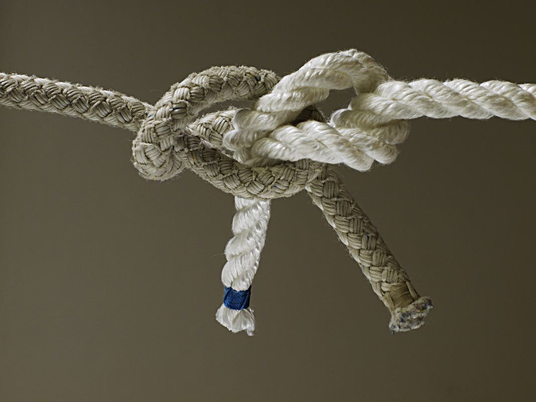
The problem is the background.

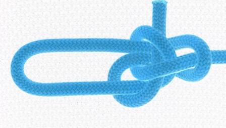
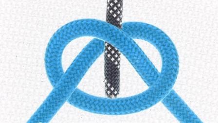
If you only want your subject material to be visible (ie the knot) and nothing else in the image area - you must shoot against a white background and you must have high intensity lighting.

Obviously, the color of your rope/cord is a factor - eg yellow might not be easy on the eyes if it is against a white background. But despair not - for there a vast number of colored ropes and cords to choose from. Many of the photos I posted in this forum use blue rope - and this seems to contrast well. If you are trying to show the structure of a bend, again it is important to choose 2 colors that contrast well.

EDIT: In my opinion, simple plain colored ropes/cords are generally a better choice. Patterned ropes/cords can be distracting to the eye of the beholder.

Yes, I have been hasty on some occasions and used yellow but heh, I’m human and get things wrong too.

The other factor to consider is the cost of printing. If you shoot against a white background, it is easy on the toner/ink - in that, the printer will only print the knot structure and not the gray-scale background too.
For example, I have produced some technical study guides which have been converted to Adobe PDF format. People sometimes might want to print those guides in hard copy. There is a huge savings on toner/ink if the printer only has to print the knot structure - with nothing in the background.

How do you think studio photography is done? They setup photo shoots against a white background with plenty of illumination from different angles. Of course, sometimes magazine shoots might want a particular background (eg blue to simulate a nice blue sky). There are easy ways to achieve a white background using commercial software - but many on this forum probably don’t have ā€˜Photoshop’ etc. There is free software on the net - such as GIMP. But you have to learn how to use that software.

If you want to minimise costs, simply shoot against a white background and then you can easily change the image settings in whatever (cheap or free) software you happen to be using.

Shadows:
Okay, this is a tricky one. Obviously, when shooting against a white background, you might have issues with shadows. There are ways to avoid shadows… Use 2 high intensity light sources aimed at different angles (that’s what I do), or, take your photos outside in natural sunlight. When shooting outside, pay attention to where the sun is and how it casts shadow. Angle your shot so the shadow is cast out of the background - or off to one side. The proximity of your specimen knot to the white backboard will determine the intensity of the shadow. The closer you position the knot to the white backboard, the more intense the shadow.

Because I produce a lot of technical manuals - I have been forced to consider the implications of the background in all images. In many of my earlier manuals, the background had clutter or other ā€˜noise’. Remember, when someone prints that image, the printer will also print the background and thereby waste toner/ink. it also doesn’t look professional.

I’m not suggesting that you need all of your work to be of a ā€˜professional’ standard :slight_smile: I’m merely offering a way to improve your photos of knots.

Here is a link to an interesting site: http://www.theswitchboards.com/forum/tutorials/article/8-taking-professional-looking-photos-without-a-professional
Note that the author suggests not to use a flash, but i would suggest to try with and without the flash and compare results. I have sometimes found the flash gives better results - depending on how close you shoot to the knot specimen.

If you are trying to post a new knot or start a discussion on a particular knot, it really does make a difference if others can easily see your work.

Mark

!!! :o ::slight_smile:

Let me begin by transferring a response to this issue from the
thread in which you kindly removed the off-topic distraction:

+1 +1 +1 !

It’s ironic for you, A_S, to remark about poor image quality when
your images are at times frustrating to discern on account of your
choice of cordage --those darned striped/zig-zag-markered kernmantles [sic]
are a PITA to figure, sometimes. And, in contrast, Xarax’s orange-vs-white
combinations shine in clarity. And your solid blue in the pdf, too, comes
out well.

As for a white background, geeesh, it’s a bit of a peeve w/me, but
I find e.g. white borders on mounted photo prints often to be
overwhelming in their light reflection --one has to look past/within
all that to see the subtle light of the colored image. (And, heck,
nevermind the ā€œhigh intensityā€, just use high ISO and bump your EV
if you want to make the photo brighter --night becomes noon.)

Of course, logging ā€œknots in the wildā€, one will not be in a position
to choose the background (or the cordage) --just capture what was
there, out in the wild.

–dl*

In the threat of more ghost-posts, let me capture Xarax’s response to this
issue (from the other thread) also. The enumerated points are worth the
consideration.

  1. This could be helpful in cases where inter-knot comparisons
    are expected, and esp. if size is a pertinent issue. As a bit of a
    side note, one datum that can be generated per knot is a measure
    of its material consumption, put in the ratio of length consumed
    divided by rope diameter (for non-round material, I have no answer).

  2. For the most part, unpatterned cordage is easier to discern; sometimes
    a simple pattern can be figured out (and thereby confirming/reinforcing).

  3. (Oh, well, with good photographic principles,
    Rule of Thirds !!! (use three ropes) ) :smiley:

  4. Shorter tails can show termination --and thus, tailness–
    with the other ends running out of the frame to show SPartness.

  5. Additional information could be helpful.

  6. Setting of the knot can depend : if you have a clear image
    elsewhere --to show the structure, the crossings–, then one with
    the knot set tight is useful, possibly understood in depth, or at
    least to show what a set knot will look like.

  7. It is often desirable to move the tails out of the viewer’s way
    of seeing the nub --so, artificial, in that regard, but then as they
    are not loaded and could be moved (in rubbing) anyway, this
    is no problem in understanding the knot (and should be pretty
    obvious as to what was done).

  8. Ah, better not to ask! --tough problem, if trying for a good
    broad solution. One answer is to simply show a ā€œfirstā€ image,
    and THEN have relations to that be defined.

  9. Definitely maybe. (A third approach is to reverse all crossings
    with the given (first) orientation !)

  10. Yes. One needn’t use pretty cordage all the time, if one is
    skilled with the pen/pencil.

  11. (Well, I find in getting cheap prints, my choices are no good
    for 16:9 --of which I have many (landscape is obvious case)–,
    and only 3:2 & to a lesser exactness(?) 4:3 are anticipated.
    –and even then, there was cropping (Snapfish)! grrrr)

  12. I don’t find B&W to result in smaller files --not for JPEGs out
    of the LX3, anyway (was surprised at this, too!).

–dl*

Heh Dan,

I want to make it clear that I’m no expert when it comes to photography!

I only wanted to offer some tips in an attempt to generate improvement. Any time you post information - I guess you have to be prepared to cop some heat.

Like I clearly stated above, I have (and still do), make mistakes.

I totally agree that plain colored ropes/cords work best - and blue contrasts well against a white background.

In my case, most of the ropes I have come from the climbing world and so have patterns. The blue rope I have often used is in fact a Beal ā€˜Joker’ 9.1mm EN892 dynamic rope. I don’t unfortunately have a second plain colored rope of similar diameter which contrasts well against the blue rope. I may decide to go and purchase a short length of 9.0mm diameter rope to specifically improve my own work…

Look; if this thread yields some improved photography (including my own) - the gamble of posting this info in the first place will have paid off :slight_smile:

…

i’ve queried over this, i dare say so has http://www.animatedknots.com/fig8join/; as they take 1000’s of pics i hear, and then are very picky about what they want to choose.

Professionally some would take stills on blue background (not allowing shadows), then use ā€˜filter’ to remove blue; and then add a background layer of any choice; can even then process shadow from knot onto background. In video, a ā€˜green screen’ is used as back drop , then remove green and give background. For this process, shadows can be tattle tales of being processed, but in the end can be seen as giving depth and quality. i’m no expert either, that is what i’ve learned over time.

i did some knots a while back, sometimes would have a coat hanger thru center of line, so can form knots in process, with line floating in mid air etc..

Color-wise i prefer neutral background, but more to off white side, then darker contrasting rope(s). Color is very important for clarity, but also as something goes to ā€˜eye candy’ can seem to fascinate/ mesmerize to perhaps slip points across easier? Certainly aggravating distractions and difficulties are in-efficiencies that subtract from potential totals of knowledge transfer and speed.

i use eye in line sometimes to show SPart, slack line would show Bitter. Force flow thru these pipelines of rope should be shown (and to what levels they exist).

In Flash though i’ve gone to math vectors of lines of bright colors on black emptiness as contrast. Part of the reason is the shadowing itself. Actually ropes are white, then placed inside of container to remove red + blue, to leave white for the effect to apply after shadowing layer. i give all ropes shadows of black gradient all the time; but they only show up when not over black background, and upper layers shadow lowers; giving less ā€˜sterile’/ more real/ organic feel IMLHO. Still quiet far to go with this, always and all ways less time to do it in; as i fumble along without a guru! But somehow convinced it is the way to show similarities, force flows etc.; that in the building lends it’s own insights to knot lacing constructions.

I wholeheartedly agree with this. I always found strange that nobody was talking about this, and nobody was including a number that could quantify what we describe as ā€œthe economy in knot materialā€. I the ā€œknot warsā€ I plan, I will include this number ( along with the numbers that show the volume of the knot, and the distribution of that volume : The two or three numbers of the radius,length or the length/width/depth of the right circular cylinder or parallelepiped.

Yes,but we do lose some information with the purely monochromatic ropes ! With parallel stripes, for example, we could follow the lengthwise twist of the rope around its axis…

Sort, but not so short…Just shorter than they should be, for security reasons, in real life
Sometimes, I leave them very long, so they do not terminate within the picture frame, so I do not destroy the feeling of symmetry I wish to convey. I follow the convention to place the standing ends of a bend alongside the horizontal + longer direction, and the tails alongside the vertical + shorter direction, or an inclined at 30, 45 or 60 degrees direction, if possible.

Yes, but those additional, graphic ( non photo-graphic ) elements destroy the aesthetics of the picture, that is also a helpful thing, because knots are also artefacts, and they are often admired for their looks, as well as for their function. If an information is needed, and not provided by a picture, why not just shoot and show another picture, that could somehow provide this information ? Is nt it what we do with the front and back views of the knots, or the pictures of their tying diagrams ?

Yes, but sometimes one tries to do more things with one only picture ( because roo is complaining about the spendings of his bits and bytes… :)) I often leave the knot quite loose, so the reader can see through the knot and understand its structure, without the need of a second picture.

But this will only show the mirror knot, not the original one. You have to reverse the colours of the ropes of the two links, too, to regain the original knot.

But WHO is printing his pictures nowadays, with the 30 inches computer monitors , the 60 inches HDTV screens. and the high-resolution high-luminosity projectors…( I mean, who younger than 36 years old, that is the minimum age of yours, as you have said that you have tied some knots 36 years ago…) I do not, and I have to say that I dont even remember what is to be 36 years old ! :slight_smile: (Or, I wish I would not been able to remember…)

No, the file size remains the same, but the grey levels should be more, so the sharpness of the picture should be higher…( Well, at least theoretically. I have not been able to prove this. Computer literate photographers out there, please help !

Wrong ! With light frequencies, white is everything, black is nothing ! :slight_smile:

Oouts ! THAT is a major blow to my black background attitude, indeed !

No, you don’t must use white. I too am one of those who prefer something nicer to the eyes. As long as the background differs from the valuable information, it can be manipulated into whatever tickles the fancy.

A transparent background is very nice, because then the image can be slapped onto most any surface. If that surface is close to the image, then shadows are of great help. Actually, shadows are helping to visualize the object anyway.

As earlier mentioned, it’s a bit subjective.

I think that this is the way for me to go, I guess ( If I wish to shoot pictures indoors, any time of the day or the night, and continue using only on-camers s flash ).
Now, where is this blue coat of the housewife ? ( Will I be forced to take pictures only while she is sleeping ? :))

I use a piece of leather for my knots. If I get into problem with reflections, I use the non glossy side.

There’s no more appropriate time to say ā€œthis thread is worthless without pics.ā€ Links to pics will do too.

http://mytreelessons.com/ks/mz/lines_of_force.swf

Here is a tip that I was given some time ago:
When photographing a knot tying sequence - start with the knot in its final form then untie it one stage at a time - of course you then present them in the tying sequence!

Gordon

Fairlead, I do this all the times, just because I want to be sure that the presented tying method is of the presented knot… :), because, with so many knots, digital pictures of them and digital archives of those pictures, one is easily confused after some time. But WHY should we presemt them in the tying sequence, and not in the un-tying one ? You offered me an idea, and I am going to think a while about it. In simple mechanical situations, like what the knots are, there is no ā€œtime arrow|ā€ in nature…Thank you ! :slight_smile:

Background colour does not matter very much so long as there is good contrast between the cordage and the background - white cord, black bg - coloured or dark cords - white bg. My preference is for coloured cord on a white bg as per Marks recent images.

The key issue with bg though is that it should not have an detail in it - no wood or cloth or wall paper - you are looking for a knot, not a still life composition.

A tip on lighting, again to get contrast into the knot in order to show cord texture and shape is to use only one light source, this will cast structural shadows into the knot, but use a diffuse light source so that the shadows are not hard or they will be black and not show an detail (don’t photo in full sunshine, it is much too hard on the shadows)

If you have control over camera aperture, set the aperture wide open (as small an ā€˜f’ number as you can get) - then get the camera as close to the knot as possible and still get a focus. Finally, suspend the knot a fair distance from the background - the background will then be out of focus while the knot ā€˜hopefully’ is in sharp focus and standing out sharply from the bg.

Derek

If you get the camera as close as possible, and you set the aperture wide open, as you say, you do not have a sufficient depth of field (you have a shallow focus), so, if the knot is bulky, parts of it stay out of focus…I prefer to use the tele range of a super zoom lens, that distort the object much less than a wide angle lens, but to get a focus I have to climb on a ladder, and go up and down many times, to be sure that the free ends of the knot are placed right …and you can not place a tripod on a ladder, so it is difficult to place the center of the knot on the center of the picture s frame ! Pain in the back ! :slight_smile:

Easier said than done…And how do you suspend the two or four free ends, so they go to the right direction into the picture frame as you want them to go ? (Stay aligned, for example, or parallel…) You should have many years of experience with marionettes, to be successful in this! :slight_smile:

I think the crucial part in any photo is lighting.

When we want a neutral background, any colour might do, even one that does not contrast from the main subject, provided there is contrast in just any way between the subject and the background.

The image I attached is a colour photo of two almost monochrome ropes against a likewise almost monochrome backdrop. The difference in structure between the ropes clearly outlines which parts belong to which rope. The background coincides in colour with the ropes. The f-stop is small, in order to have sufficient depth of field over the subject, but at such a small distance with a tele lens, the depth of field does not include the background.

The knot is suspended from one of my light stands. It hangs vertically, the braided rope topmost, and the camera is held in portrait position. Lighting is backlight from a large window above and to the right of the background, which is the inside of my balcony door. A white screen at the left side reflects some light, to alleviate contrast and to brighten the left side (bottom in the image as posted). A shaving mirror throws some light onto part of the knot structure to enhance detail.

I think it is possible to trace the entire knot in spite of lack of colour contrast and with little contrast against the background. It should be possible to do the same also with brightly coloured and patterned rope without much risk of confusion, just putting attention to clarity in the image. It is a matter of using the light to make the image, and trying to make any important part visible, although it needs not stand out brightly.

Good sharpness is a boon, but not entirely necessary, the crucial part is the way light falls upon the subject.


carrick_bend.jpg

A most excellent demonstration Inkanyezi. Good to here from you.

alpineer

Inkanyezi, you are a f…good photographer ! ( So, you are NOT permitted to do mistakes when you shoot knots… :))
Now, you suspend the knot in mid air, so it is easier to use the shallow focus effect…But, doing this, you have no control on the orientation of the free (not tensioned) ends, which follow their own directions. I want the orientation of the free ends to be somehow controlled , so I have to lay the knots on a horizontal plane. ( Or, I have to attach invisible lines to the free ends, and exercise in marionettes handling…) Also, you can not suspend a loose knot ( that serves as a tying diagram) : many, even all, of the parts of the knot should be suspended in such a case, so you have to be an expert on marionettes as well ! :slight_smile: If you let the knot on the ground, and use a tele, as I do, you have to climb on a f…ladder, to get your subject into focus, and go up and down the ladder to make corrections. And you can not put a tripood up there, on the ladder ! Also, there, it is more difficult to focus on the knot, and have all its parts sharply focused, into the shallow depth of field. My pictures suffer from this problem…

An easy way to recover, somehow, from this blow, is to invert the colours of the pictures, so, a black or dark background turns into a white or a soft white background.
Now, there is a trap here…Black shadows turn into iluminated areas, so the pictures get a Gothic style appearence… :slight_smile: More shadows in the original picture means more Gothic-like illuminated areas in the final, transformed picture. So, If one uses this technique, it is better to have as few dark shadows as he can.
With this simple one click trick, one can transform my old black-background pictures posted on this Forum to white background ones, so he can print them without paying a fortune in black ink…Of course, the result has no relation to agent smith s high quality photos, but the job can be done…and the orange rope turns into a blue one, without any additional expenses ! :slight_smile:

See the attached picture for such inverted-colours pictures of knots. I used the free program GIMP 2.6, and the function ā€œInversionā€, from the menu ā€œColoursā€.


Fontus bowline (flash).JPG

peace on the forum (2).JPG